


Lethbridge School Division
Lethbridge School Division officially shifted to a new logo in May of 2019.
The finalization of the logo wrapped up a two-year process, which began following
the 2017 Town Hall meeting.
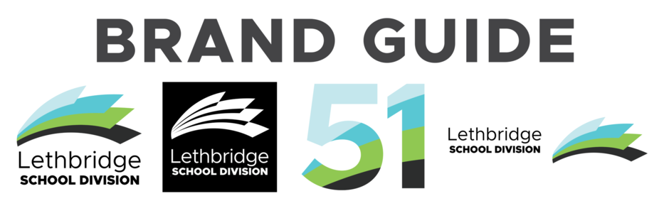
The logo not only represents the Division’s Mission and Vision, but is also representative of Lethbridge’s historical and geographical features.
Black represents coal and Lethbridge’s famous High Level Bridge, while green represents the rolling prairie landscape. The two shades of blue represent the Old Man River, which flows through the city, along with the blue skies which frequent Lethbridge, a city known for being one of the sunniest spots in all of Canada.
The logo is also representative of knowledge, in the form of an open book, a book which is being blown open by a westerly wind.
Brand Guide document
To view the Lethbridge School Division Brand Guide, please click on the link below: